The German Insurance Association is the umbrella organization of private insurers in Germany with around 460 member companies and is one of the largest institutional investors in Germany. A new communication strategy, integrated in a corporate design relaunch, sets new standards in their field: a transformation from pure industry representative to a voice that moderates the interests of business, politics and consumers in its communication. As part of WLDX we supported the association on their transformative path to a more diverse and sustainable brand identity by creating the visual brand elements.
A sign of transformation
The new logo is the association's most important brand-forming element. It incorporates all the key design elements that shape the overall image. The new polychromatic color palette, which replaces the previously monolithical and omnipresent brand color, reflects a commitment to diversity, openness and multidimensionality, and thus indicates the far-reaching transformation of the brand narrative.
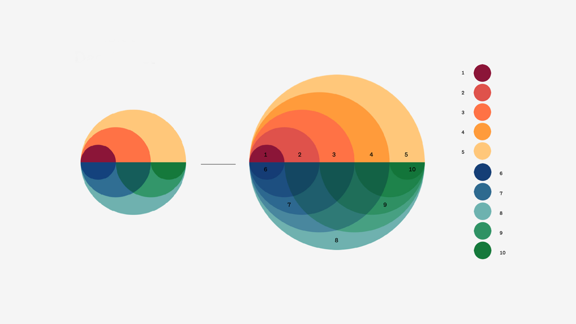
The geometrically faceted shape represents the pluralism of actors, perspectives, but also the complexity of modern-day life. At the same time, order is created through a strictly geometric composition. Saturated vibrant colors reflect the new self-image of the association as a driver for more sustainability in the insurance industry.
Multifaceted, multi-layered, complex — without being complicated
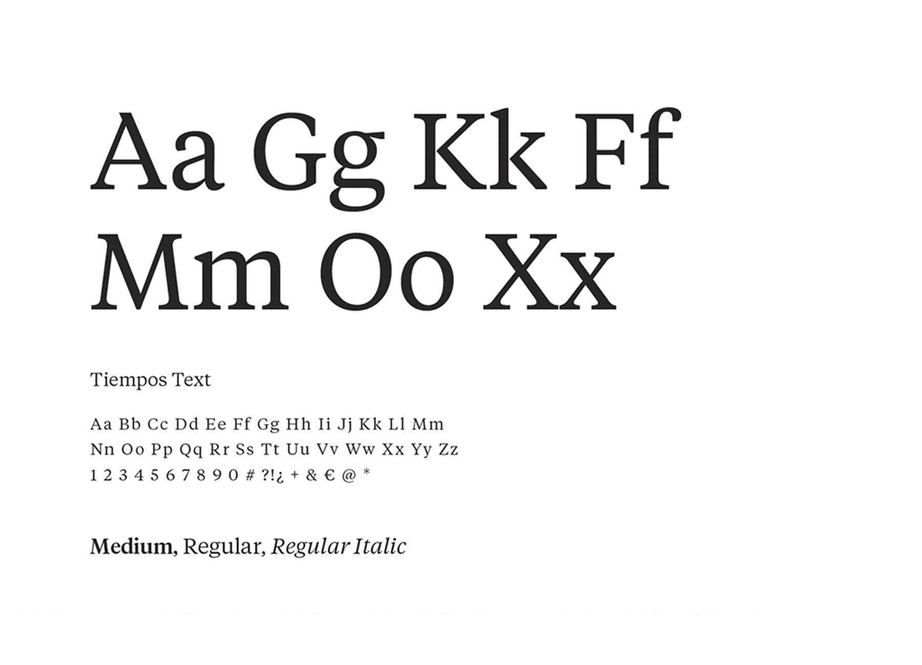
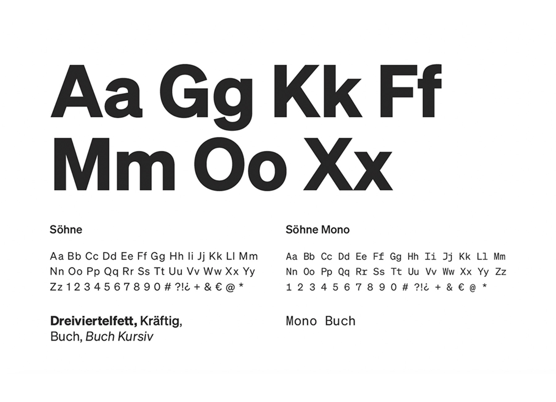
Contrasting typefaces
The tension between the two GDV corporate fonts is created by their contrasting nature. The characteristic look of GDV only emerges through their successful combination where the boldness of the sans serif Söhne meets the toned-down understatement of the Tiempos.