With its 50th anniversary, Bielefeld University presents itself with a new image. Founded as a reform university in 1969, academic history was written in Bielefeld in a very short time and work is still being done there today on the major problems and issues of our time.
Transcending Boundaries
Accordingly, the new image reflects this seriousness and the hard, often lifelong work on a subject. How can we give science back its dignity and thus set ourselves apart from a higher education landscape that is increasingly short-winded, fragmented and market-oriented?
Our answer: with radical, formal reduction. The logo: a black, almost Malevich square. The typography: a rational-geometric grotesque. The design: sober, based without exception on a strict grid. After a year of work, the new corporate design of Bielefeld University was presented to the public in a festive act on 10 May 2019.
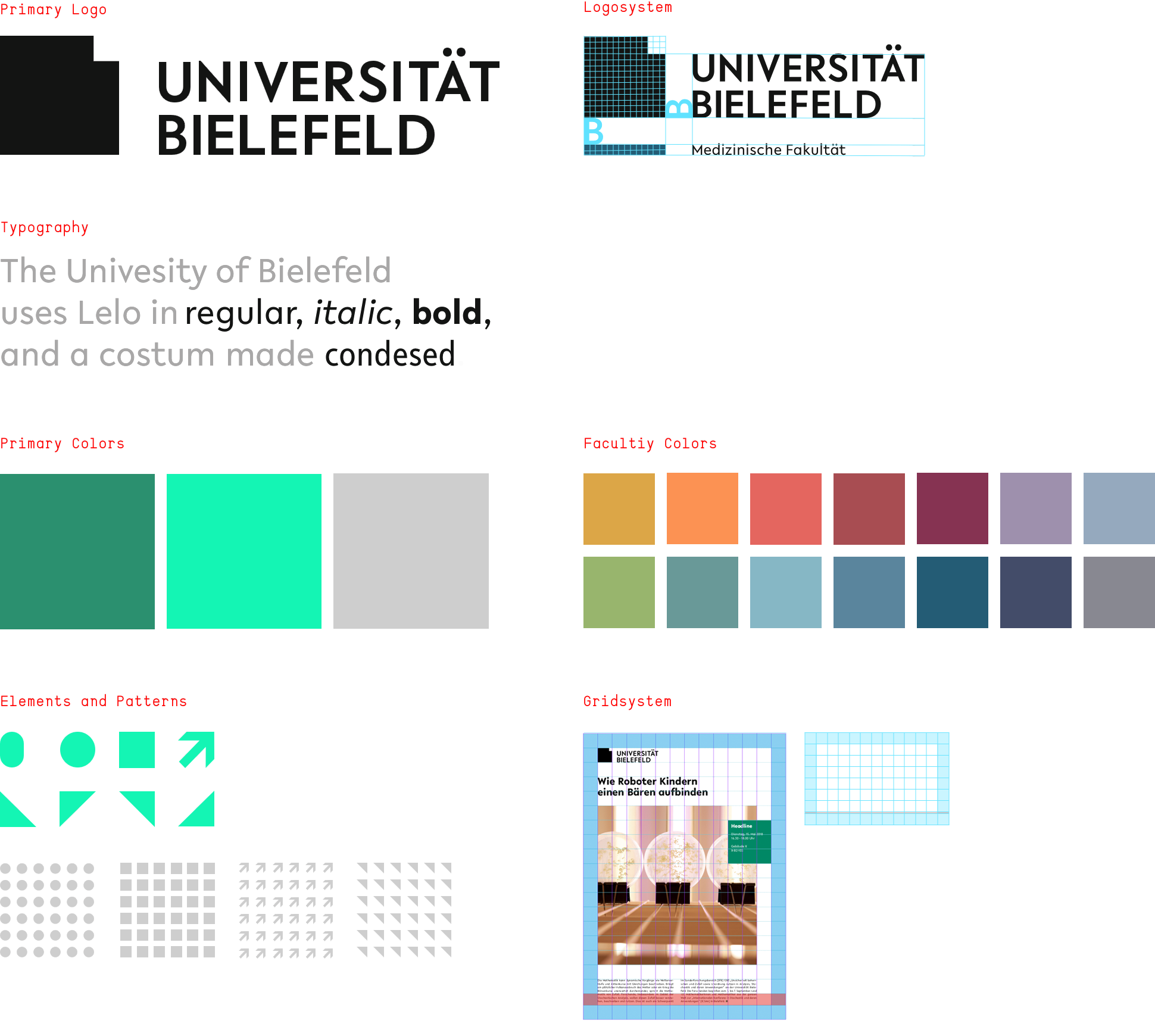
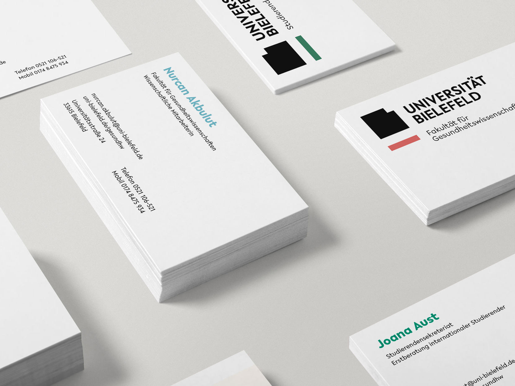
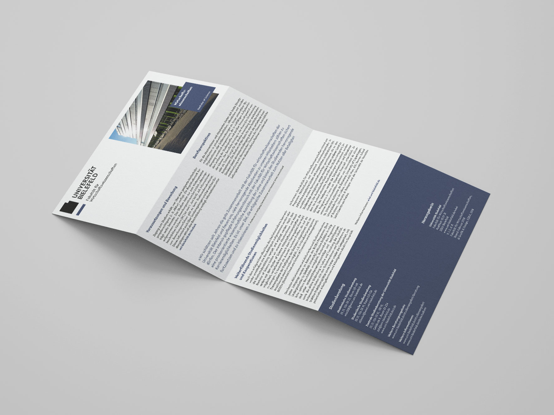
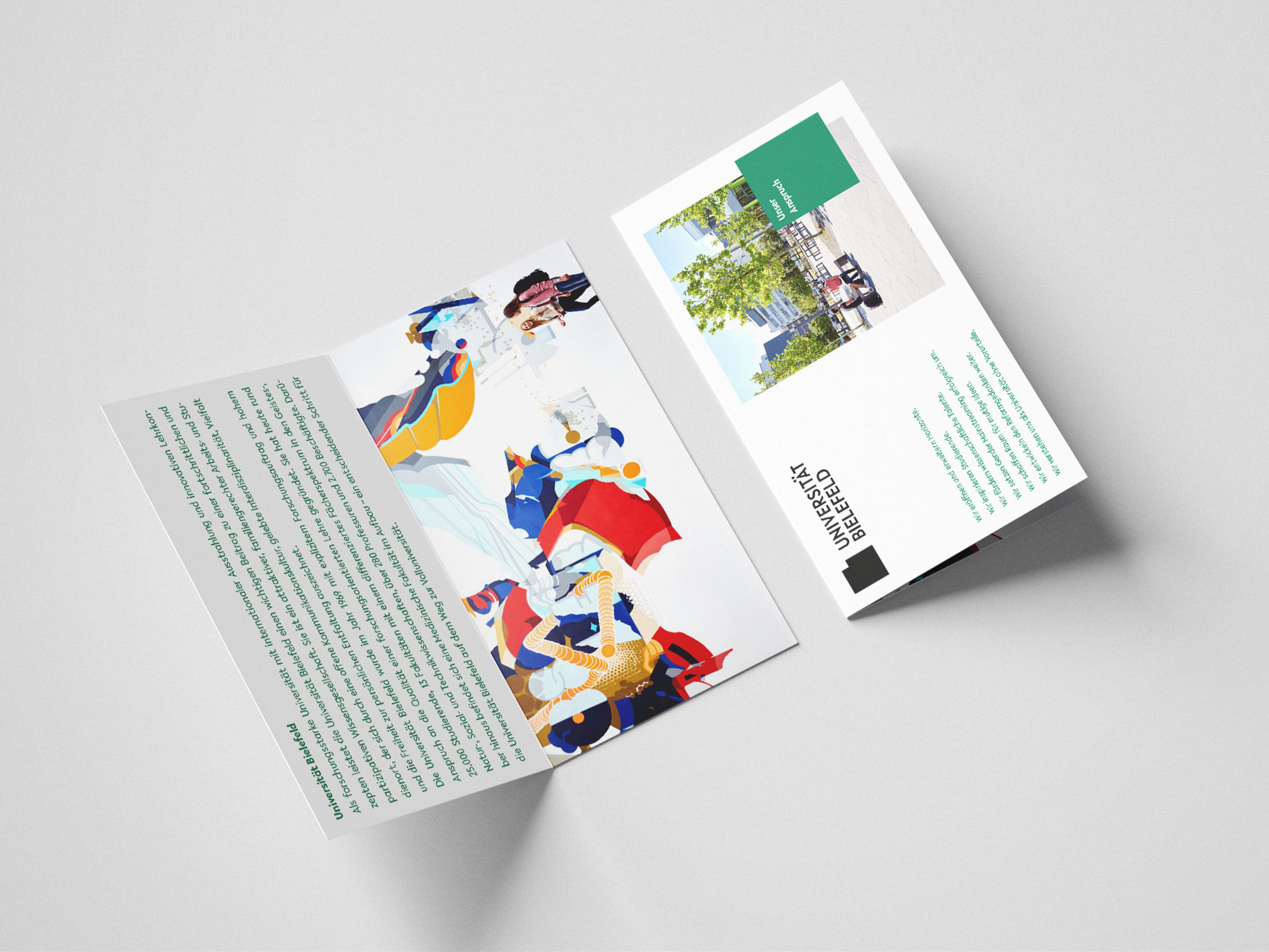
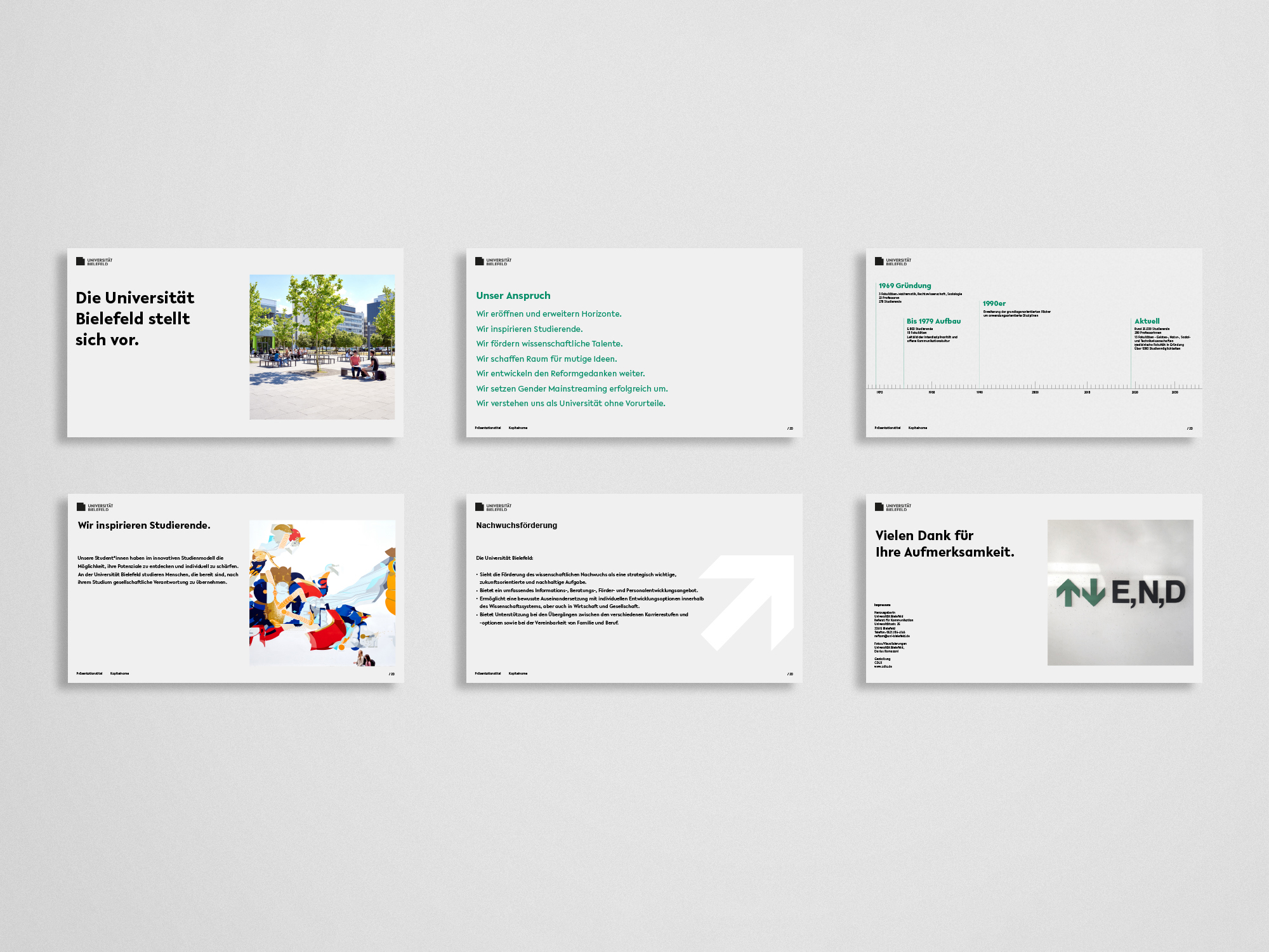
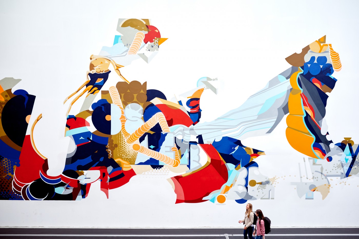
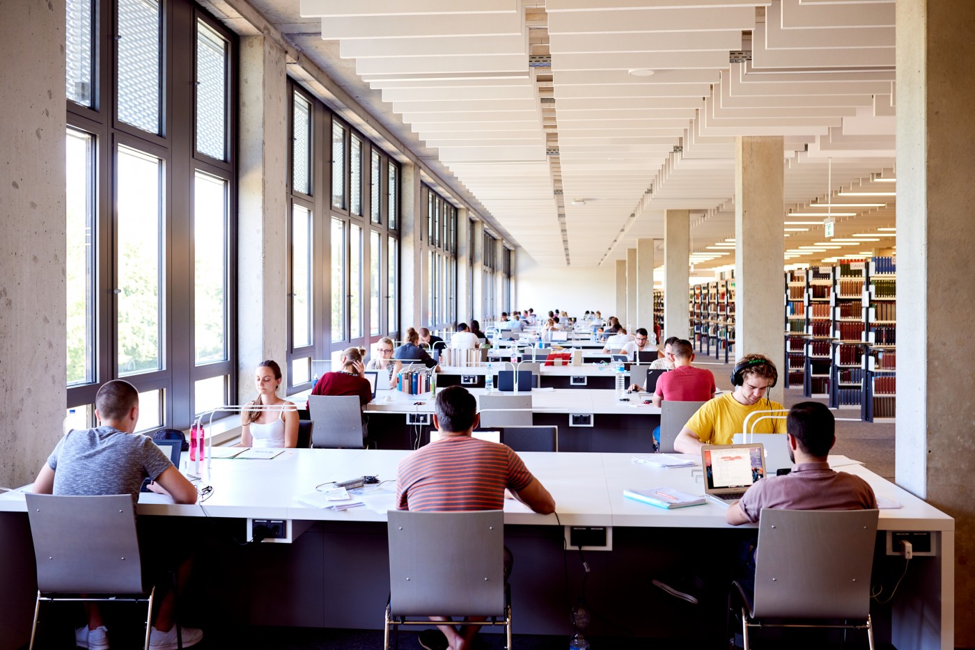
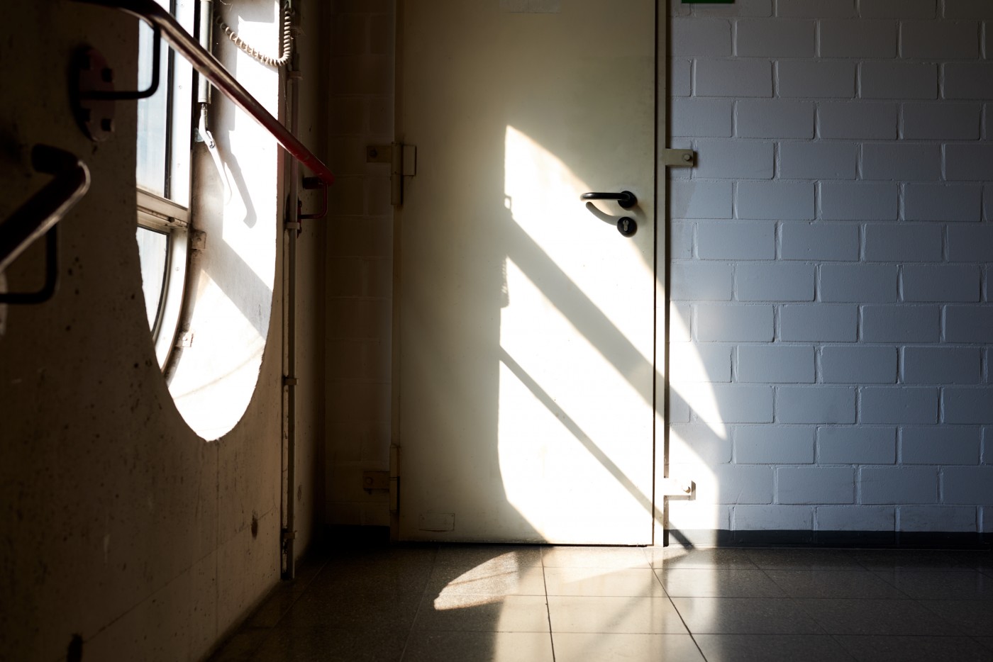
Together with the logo and various style-defining elements, templates for the business stationery and other digital and analogue media were developed. The Universität of Bielefeld was also provided with a pool of images that feed into the new look. The fotoshooting was directed by CDLX and produced with photographer Darius Ramazani.
Stationary
+
Photography