Can we explain the world with data? Perhaps not completely. But we can get to the heart of complexities, establish comparability and emphasise the obvious. Climate Analytics is an international think tank that accumulates and visualises scientific data on global warming. Our team of user experience designers and data developers created rich data visualizations for »communities and peoples on the frontlines of the climate crisis«.

Data visualizations
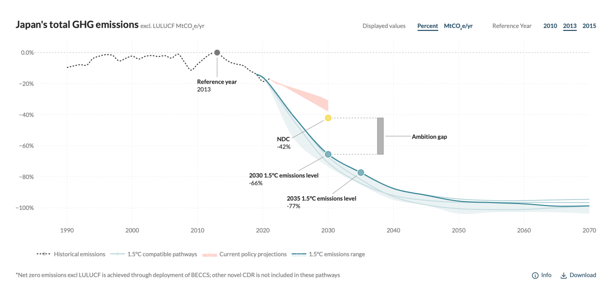
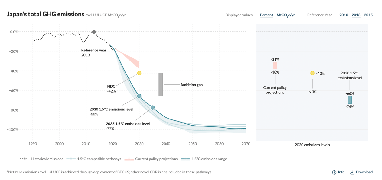
Together with Climate Analytics, we developed a webtool that provides national emissions pathways required to meet the 1.5°C temperature target of the Paris Agreement and describes the key features for 64 countries.
We developed the design of the website, but the focus of the project was a collaboration between the client scientific team and our developers to create rich data visualizations using Plotly library. For each country there are multiple data representations based on different IPCC reports.

In addition, we customized the CMS to enable the smooth and efficient import of complex text documents. This customization includes the integration of functionalities to handle detailed references and citations, ensuring that the process is seamless and preserves the formatting of the original documents.