AUMA, the Association of the German Trade Fair Industry, plays a central role in representing the interests of the trade fair sector to policymakers, the media and the public. Through research, analysis and guidance, AUMA supports both its members and the broader German economy while promoting Germany as a leading international hub for trade fairs. Founded in 1907, AUMA is embarking on a new chapter in 2024 with a refreshed brand identity.
Building within existing structures
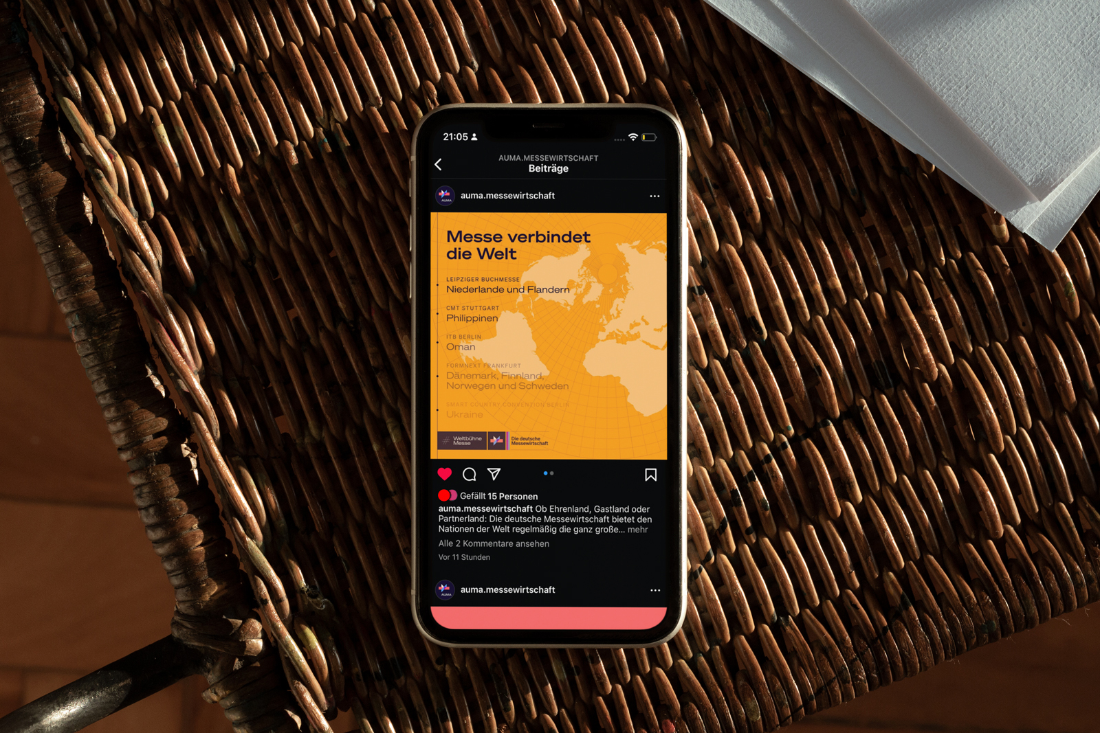
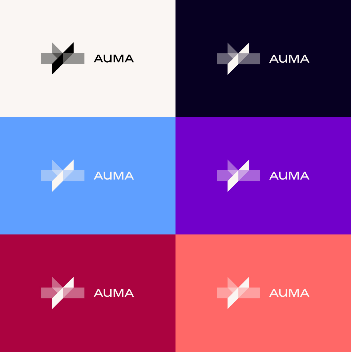
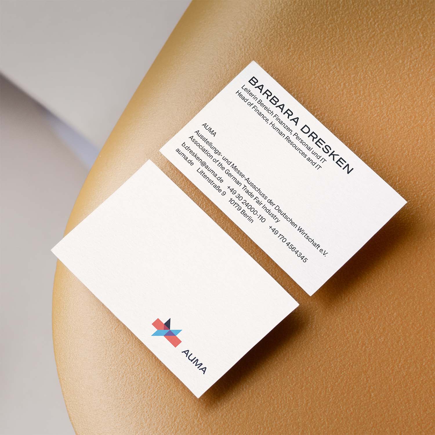
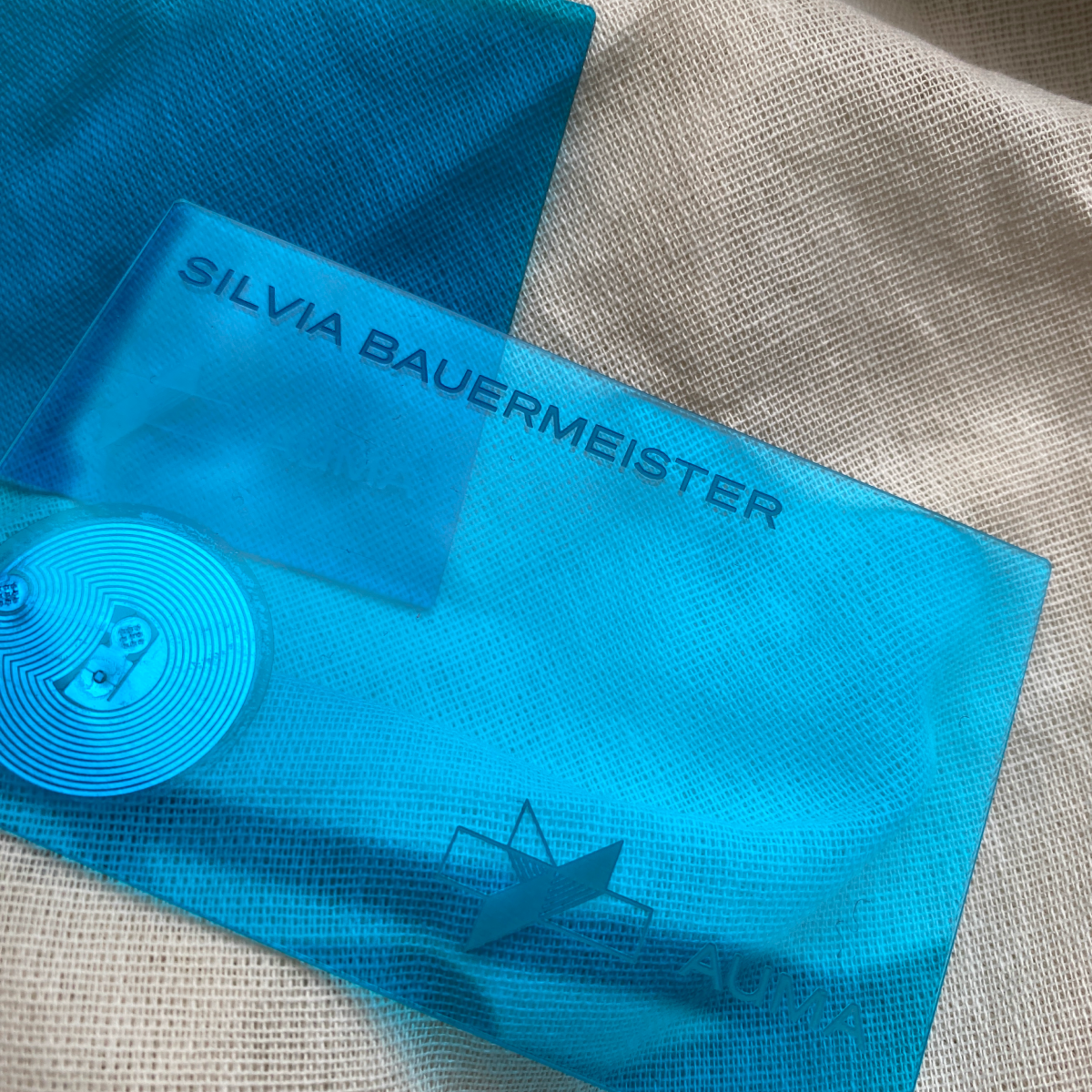
After 20 years, AUMA’s visual identity has been modernized to reflect the diversity and vitality of the trade fair industry. This transformation includes a “new old” logo that honors the organization’s heritage, alongside a dynamic color palette to convey energy and inclusivity. Updated typography, business tools like digital business cards, refreshed industry reports and an enhanced website are part of this comprehensive overhaul.
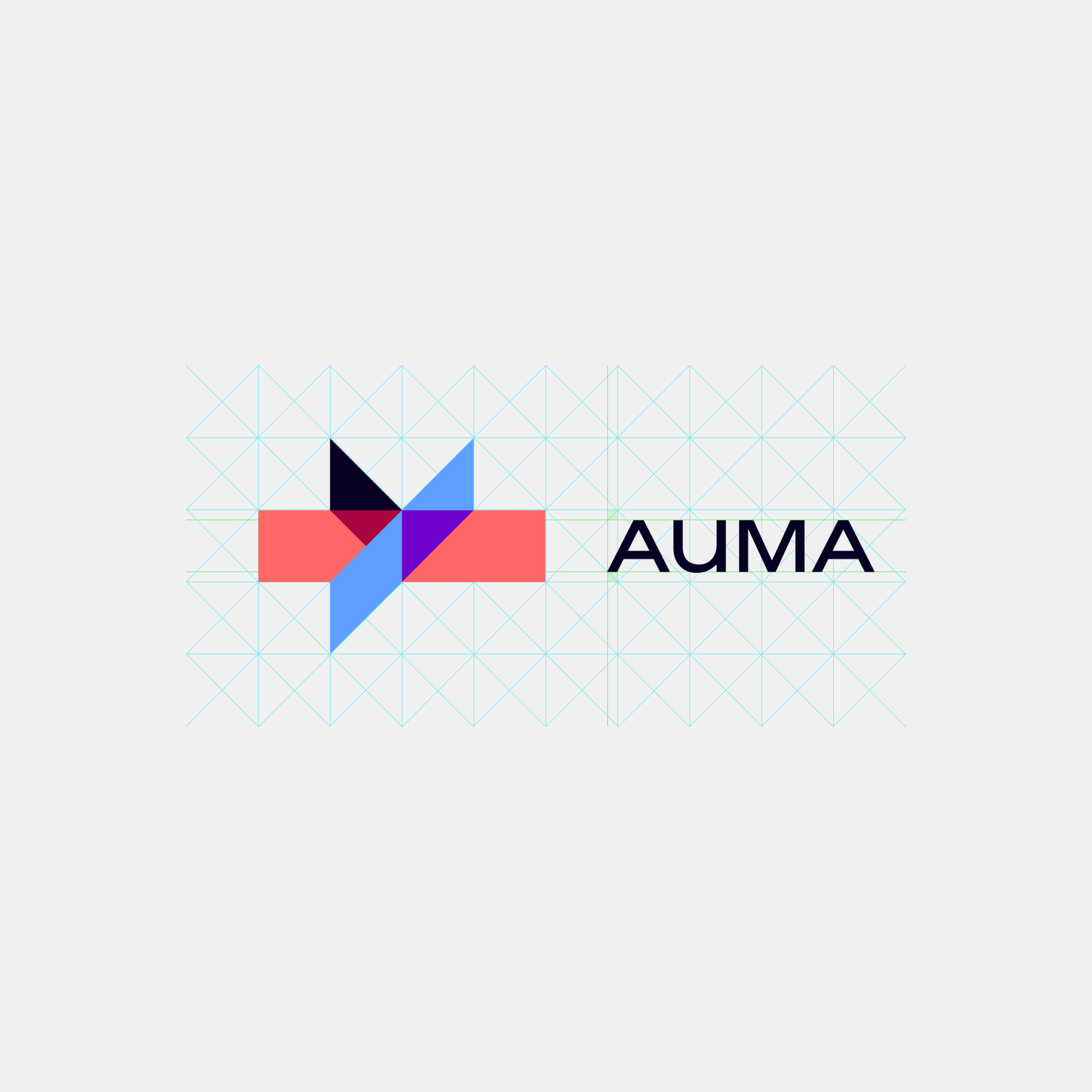
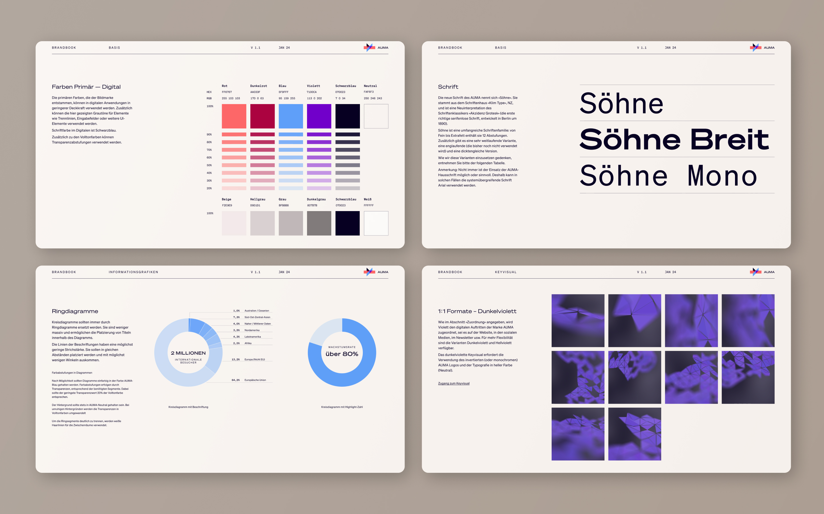
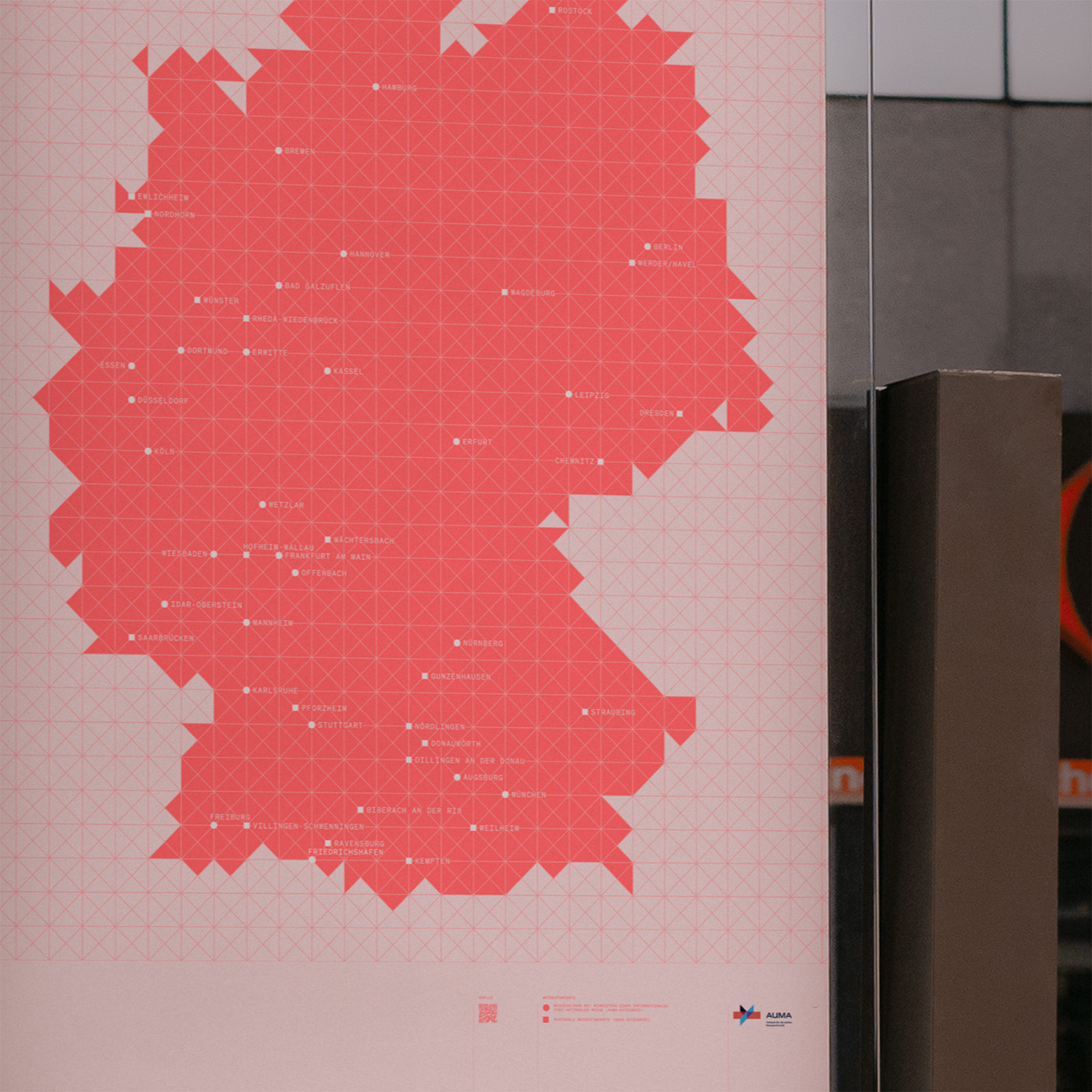
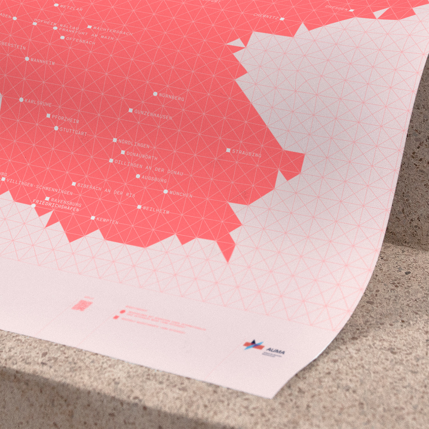
The grid used in the key visual mirrors the structure of the logo. By subtly shifting the paths, spaces are created between the elements, allowing for dynamic animations and engaging light and depth effects within a 3D environment.
Keyvisual
Brand Architecture
A unified system has been developed to ensure consistent external communication across all AUMA activities. This straightforward, hierarchical structure organizes AUMA's diverse initiatives by brand, category, and activity. A distinctive 45° slash, derived from the AUMA logo, serves as a visual connector across segments, subtly reflecting a modern, digital approach to communication.
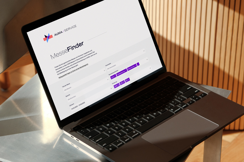
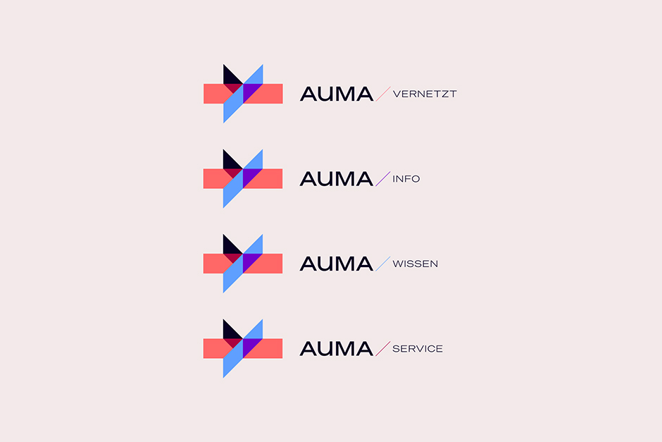
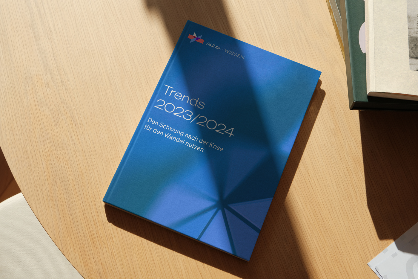
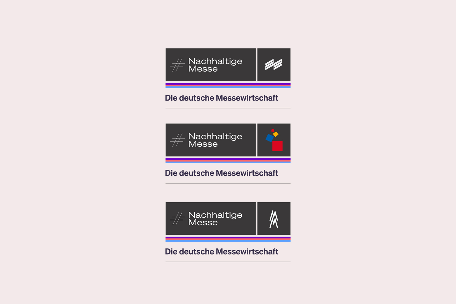
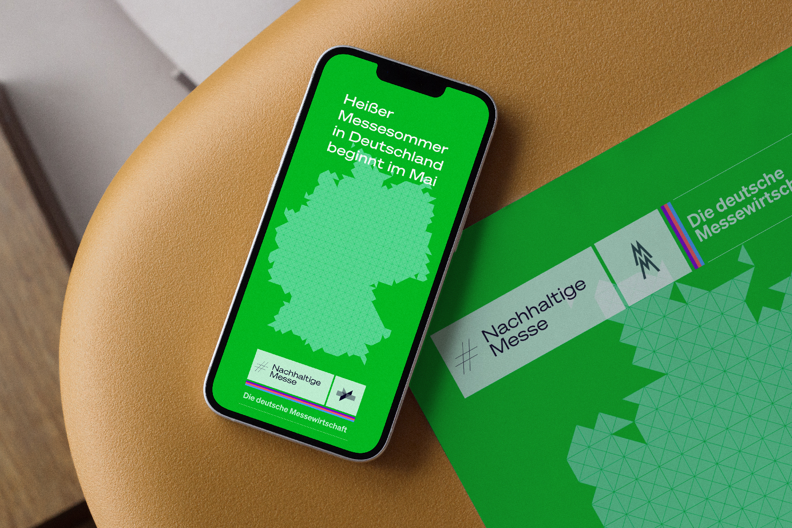
To address complex challenges efficiently, a flexible brand toolkit was created, consisting of four modular segments. Industry initiatives and campaigns are treated as special cases, where AUMA steps back as the primary brand. Instead, the spotlight is on the campaign itself, with the trade fair industry as the primary representative.
Co-Branding
