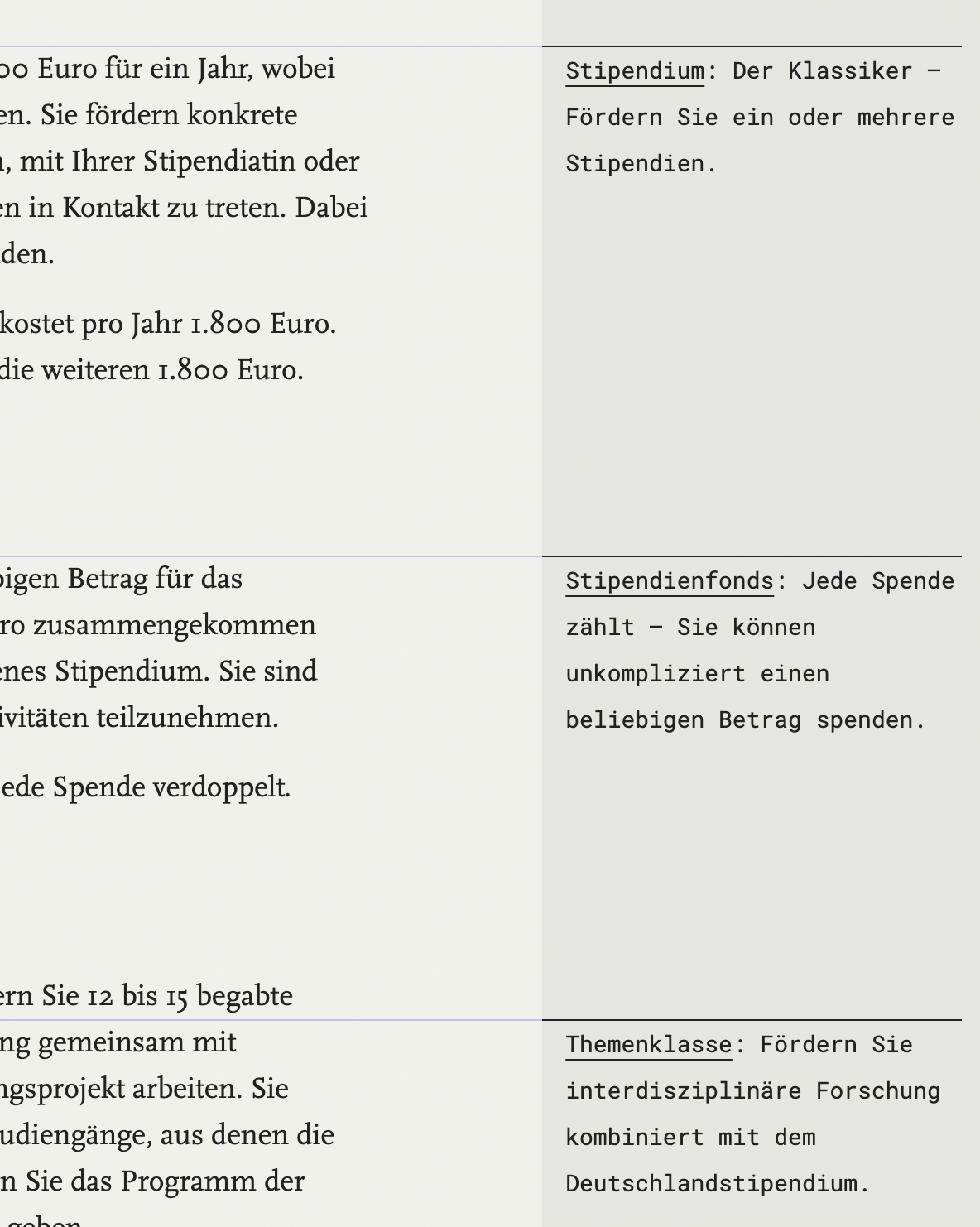
The Deutschlandstipendium / Scholarship of germany supports talented students in germany. Regardless of their background; what counts are academic achievements or special personal qualities. The scholarship is paid half by the government, half by donors and organized by the universities themselves.
Being a high quality scholarship at a high quality university this project greatly introduced our new status of the ongoing Humbolt university relaunch.
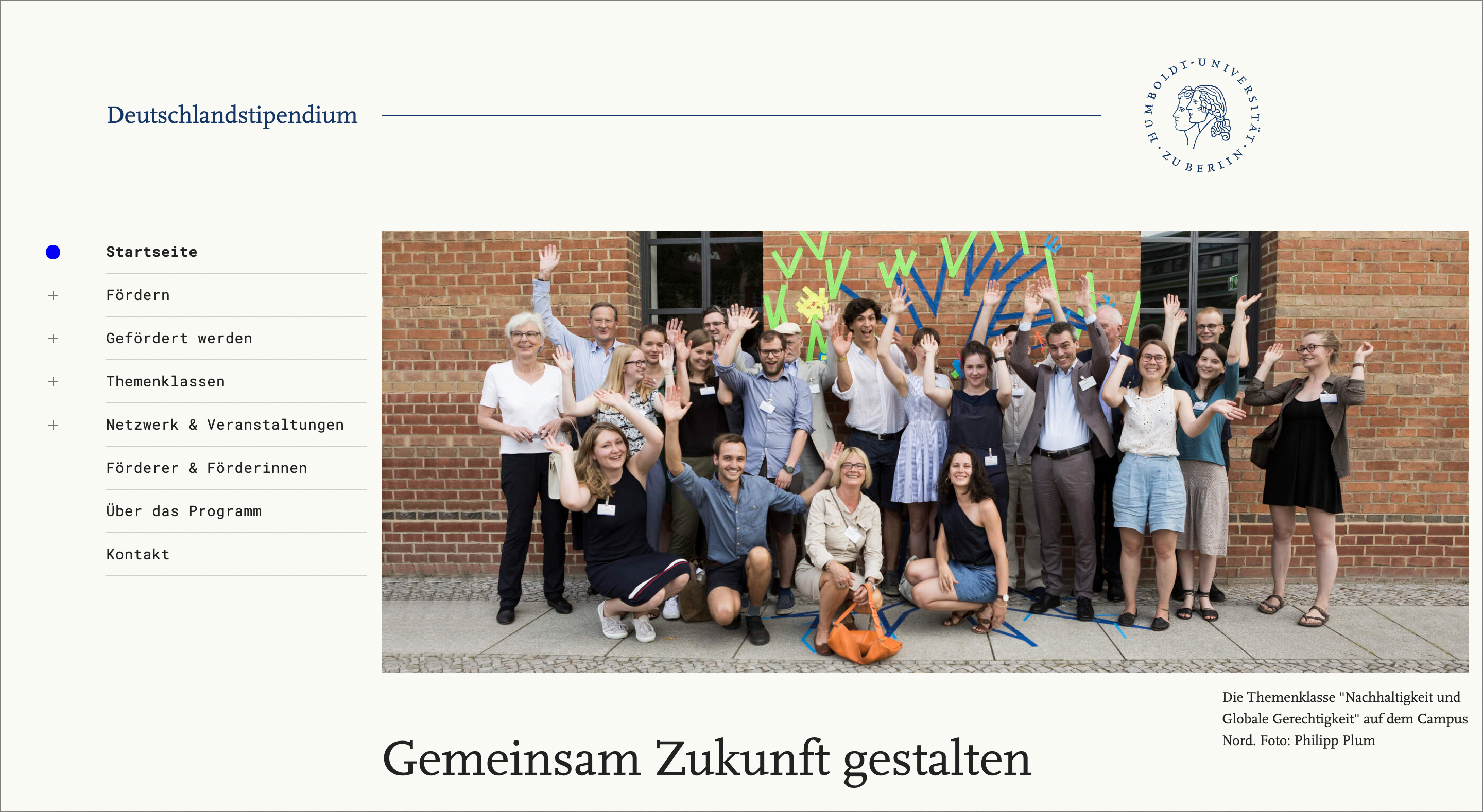
Making scholarships available for young people: that's what we want.
Especially for those who struggle and who wouldn't think they fit: Deutschlandstipendium does reward academic achievements. Other factors are social or political activities as well as overcoming personal struggles.
One of the major goals of the scholarship is not only financial support but also the connection between generations and social as well as economic groups.

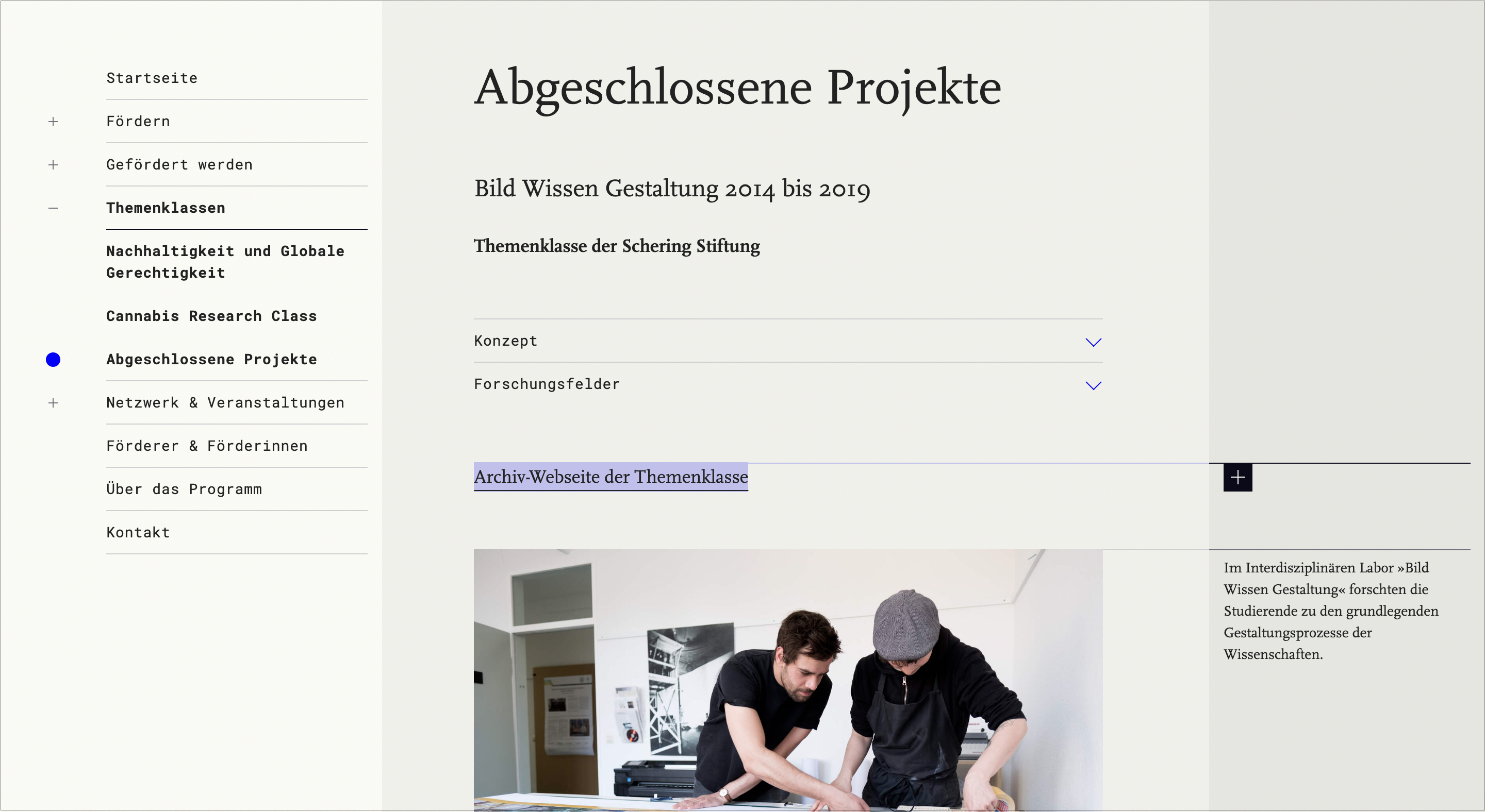
The Humboldt university is a city with various habitants, structures and parties. Changes happen mainly in detail and grow over time. The university already uses the classic font Scala and the blue tone of humboldt university. In other pilot projects we added the bright digital blue and Roboto Mono.
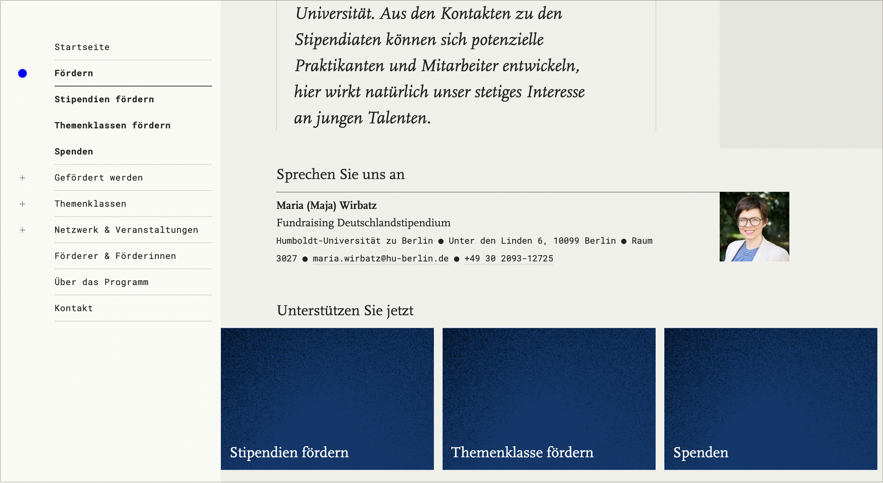
Now a new background colour was introduced that complements the classic style. It divides the page in three sections: menu on the left, content in the middle, additional information on the right.
Updates on a tanker
We introduced two specials: One is a menu that navigates without loading inbetween pages and includes breadcrumbs. The other one is a side bar for scientific notes and link descriptions.
The menu works like an open drilldown menu. Click on a menu point and it loads. Additionally there's the shortcut option to access the deeper menu points to skip page loads. The higher menu points stay to mark the path you chose. The whole menu is directly transered to mobile and stored in a hamburger menu.
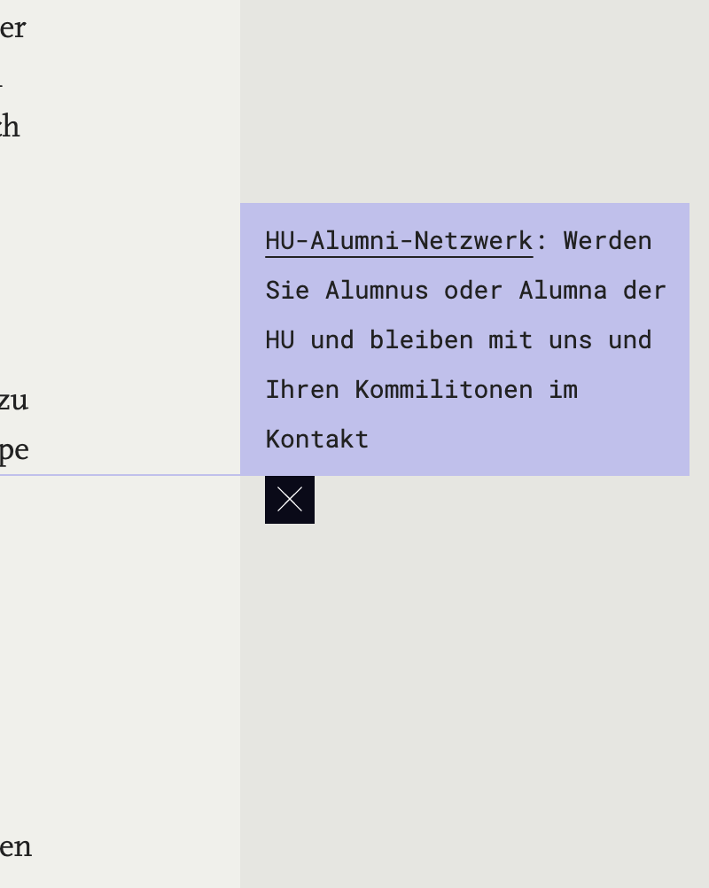
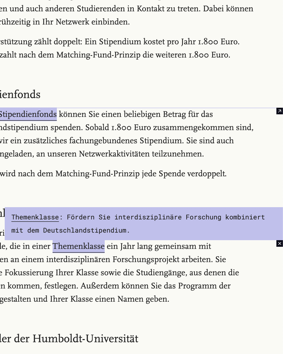
The side bar notes give the possibility to add descriptions to links or words. If there's not enough space to show the content it is hidden behind an icon. If this function is used continuously over a page it becomes a summary of the page content.
Special details