Die Junge Akademie was founded in 2000 as the first academy for outstanding young academics. Its members hail from all scientific disciplines and the arts. They explore the potential and limits of interdisciplinary work and aim to start conversations between science, art and society, and to generate momentum in discussions on science policy. Since its founding, Die Junge Akademie has developed into a role model and example for similar initiatives in many other countries.
Information architecture and platform
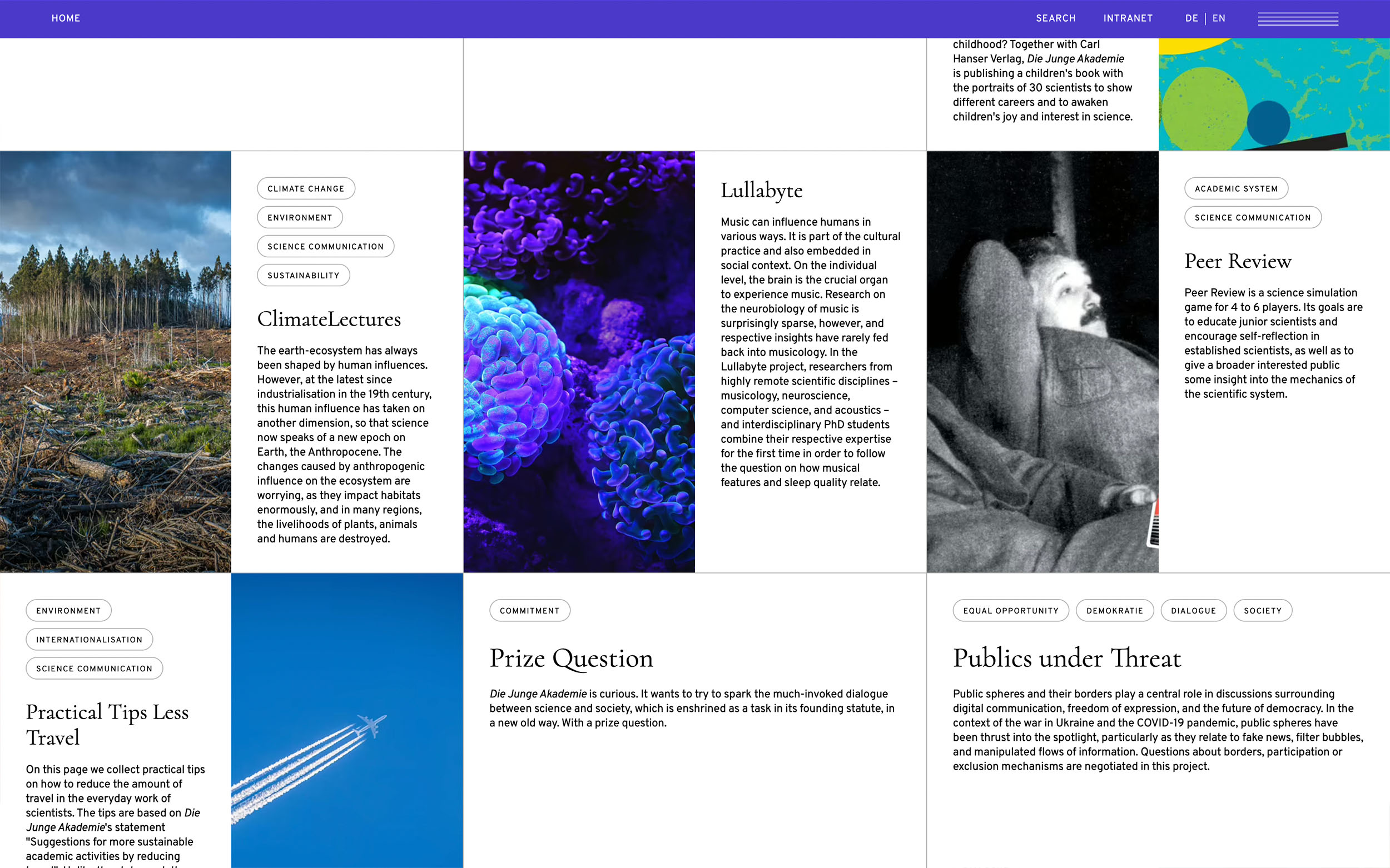
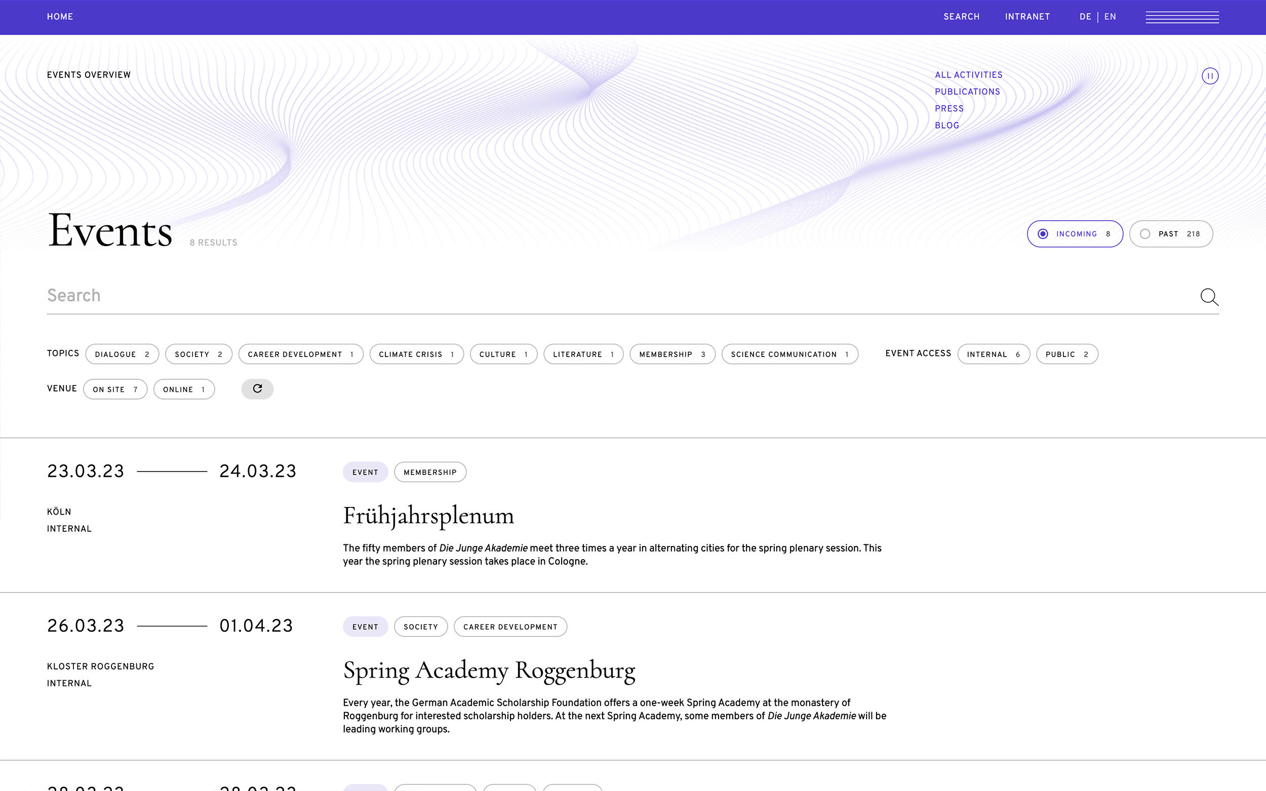
Since Die Junge Akademie has a huge output in terms of events, publications (printed and digital), projects, work groups and a ton of fellows, it was essential to create a clear structure that connects all outputs. All the content is somehow connected to each other which wasn't really clear on the previous website. Our mission was to highlight these connections but in a way that allows the user to find specific content pieces or groups. We created a filtering by topic in forms of tags that are visible and at the same time gives the user a rough understanding of what the piece is about. On top of that we have an "All Activities" overview of all the content that can be filtered by category and media but allows the user to browse through everything that's happening in Die Junge Akademie. These content teasers are also spread across the website and accessible by connected contents. Users that are looking for something very specific and need a clean overview that's easy to scan, can go to the specific overview pages of e.g. just the publications or just the events witout having to filter their way through all the activities.
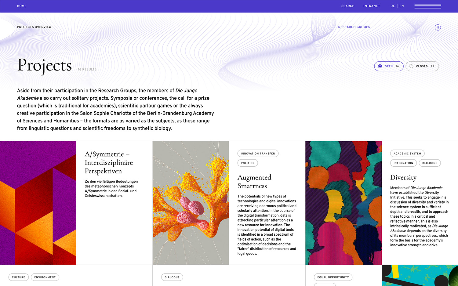
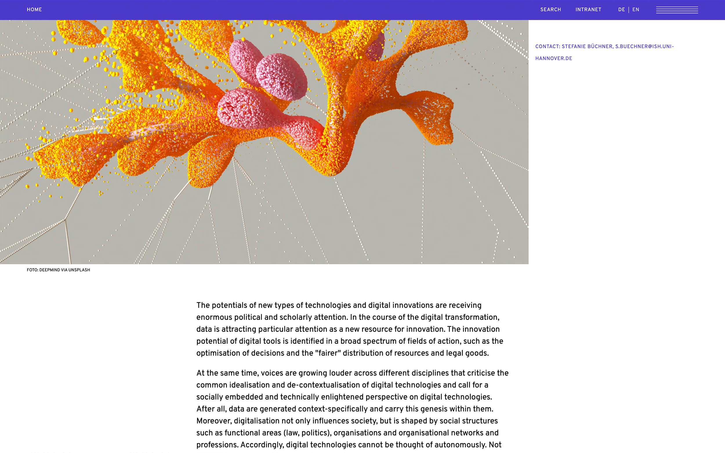
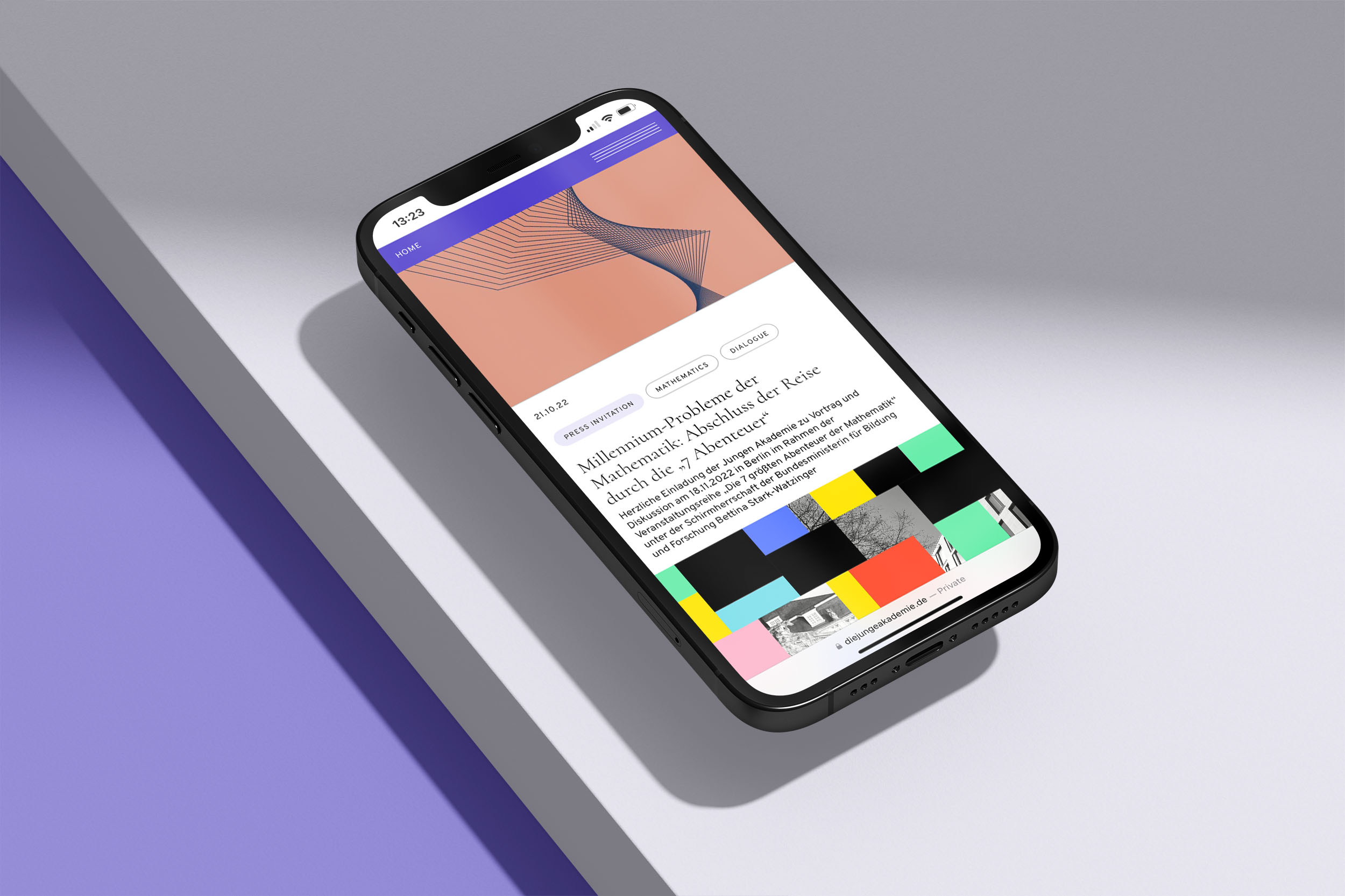
The CI of Die Junge Akademie mainly consists of 4 colors, 2 typefaces and a line garphical kevisual. To bring these components to life digitally we adjusted the colors and generated an animation of the keyvisual that can be paused for accessibility reasons. Since the colors are never used together and also shouldn't be related to specific topics, we decided to also separate them on the website. Everytime you visit the website the highlight color across the website changes randomly. To manually change the color you can double click on the menu bar and the color will change. The core elements from the content and the design perspective are the Projects and Workgroups that also represent the different topics the fellows are working on and therefore what Die Junge Akademie stands for but also the fellows themselves and of course everything they put out into the world which is represented by the "All Activities" feed. We decided to implement two versions of the feed, an irregular one that is more inviting to browse and a regular one that is easier to scan for the specific overviews (only publications etc.).
CI and Design choices
