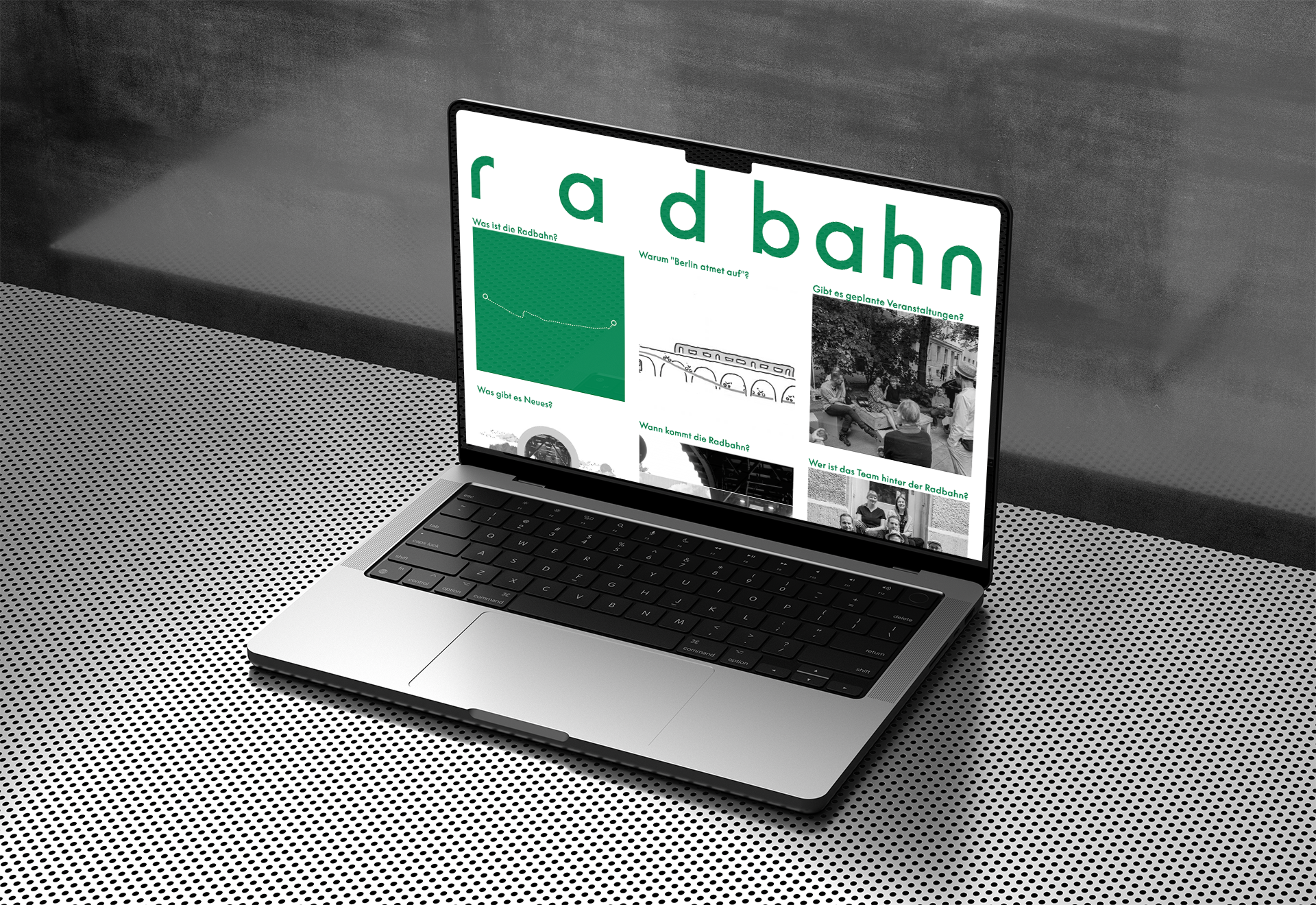
A bike lane from Charlottenburg to Friedrichshain crossing half of Berlin. For years activists work together with the government and citizens on realising this project. Waald worked on the communication, we worked on the digital part.

Berlin atmet auf
Radbahn is not meant to be a fast lane. Under the archs of the U1 that riding above the streets, it is designed to be a convenient and calm way through the city. Cycling for commuting and as a way to relax.
The way there is hard. Money has to be aquired, permissions have to be granted and citizens have to be convinced. – Some parts of the route pass Kreuzberg where many hold cars as a high value.
Waald casted this into the slogan: Berlin atmet auf / Berlin respires to value the personal ease of cycling as well as the calmness and freedom the city gets when cars disappear.

The design includes multiple topics. The easiness of a bike friendly city, the struggle of citizens movements and the ongoing movement on traffic lanes. It is a patchwork of opinions stories and needs that all flow together to gain freedom by respecting the others boundaries.
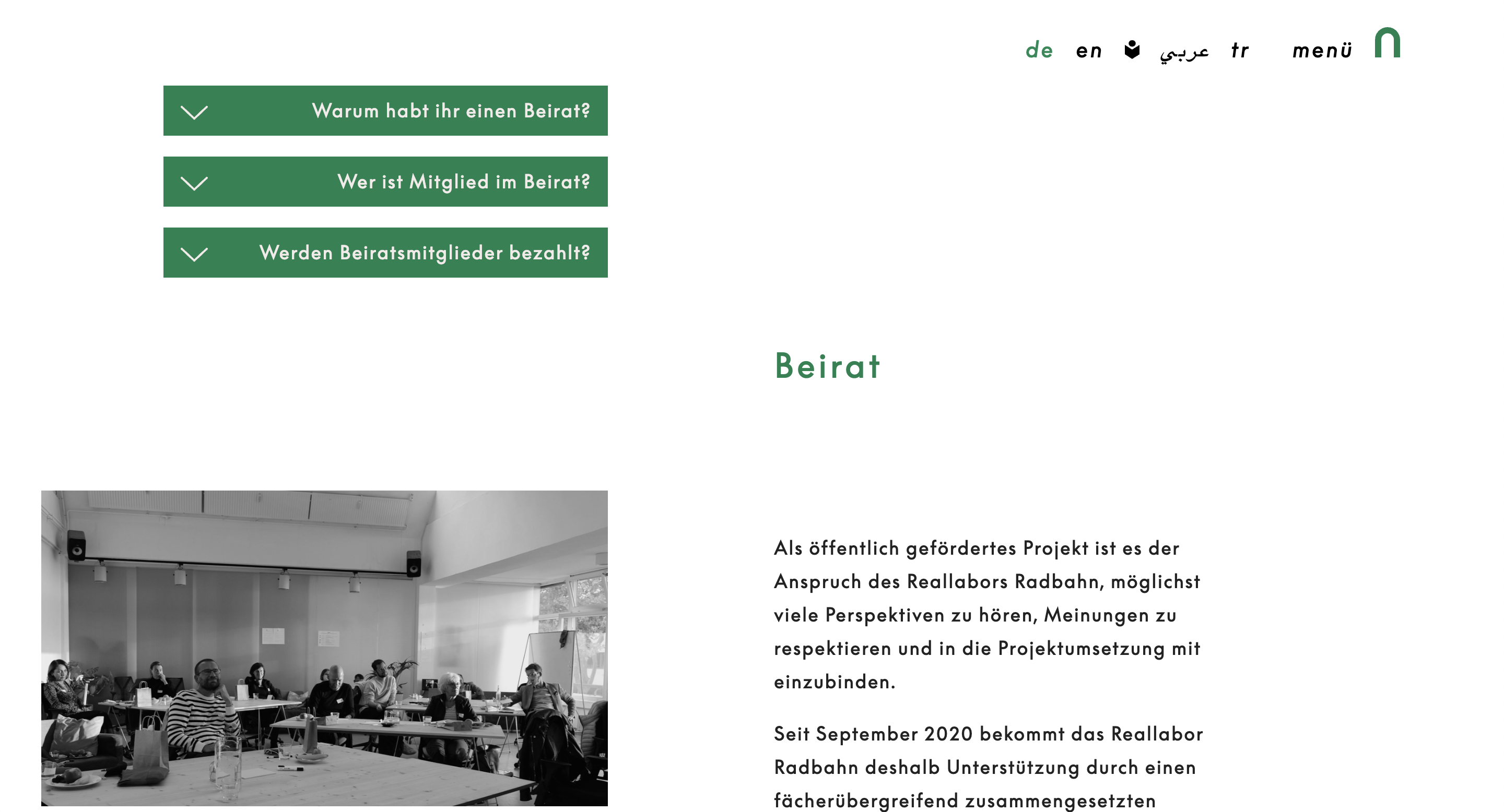
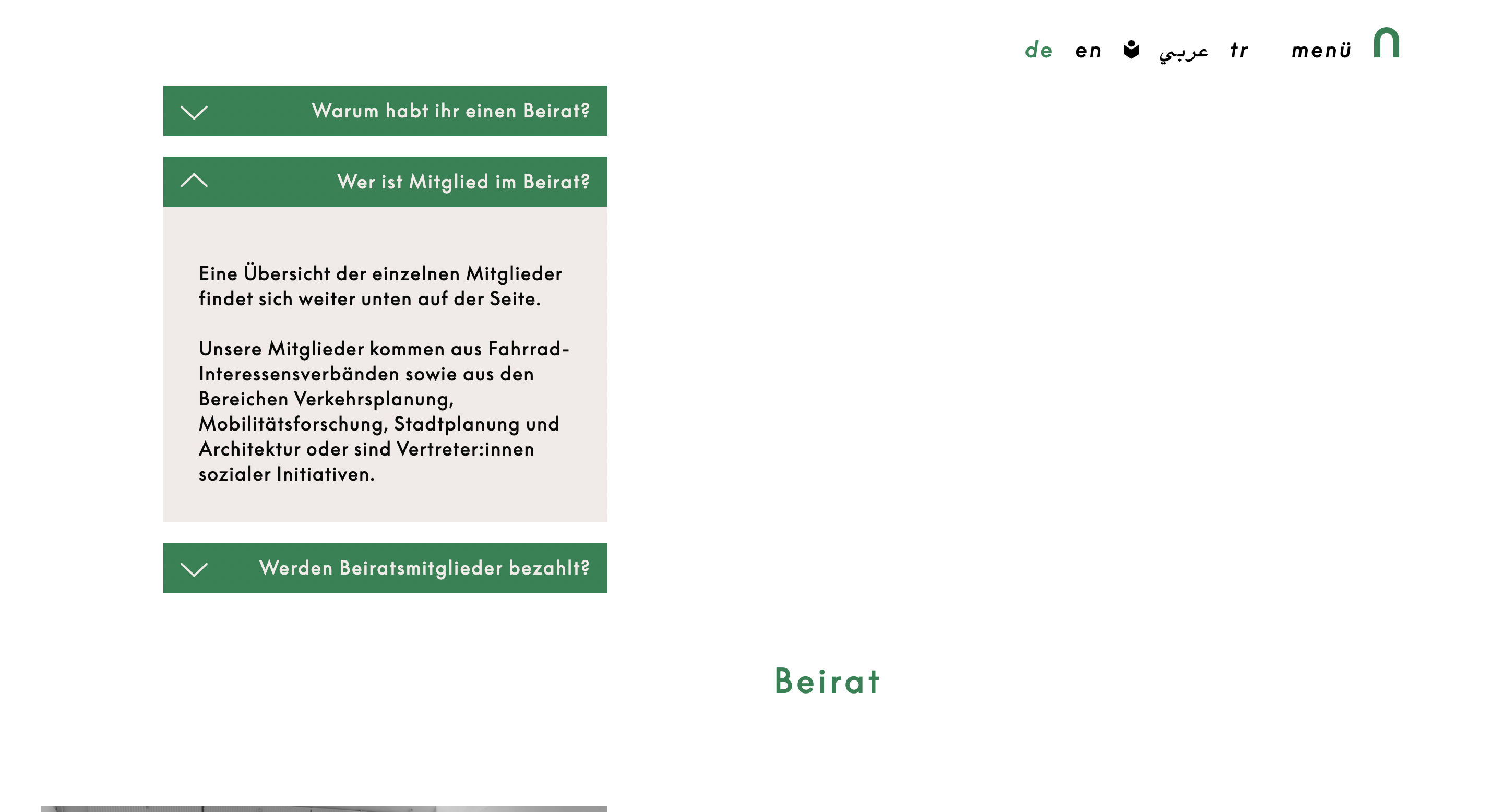
Questions are important for Radbahn. Not only that the team questions the residents on regular bases and invites to informative community events. – Everybody heard of Radbahn, little know the details. We gave a quick and simple way of navigating around the website using all the frequently asked questions as a guideline. All pages contain some of the most important questions as quick tropdowns at the start. That way multiple levels of information depth are covered.
Design

